Inclusive Design Challenges
Micro Inclusive Design Challenge for Businesses and Organizations
Our seventh hackathon explored inclusive design from two perspectives. One is to making a businesses and services more accessible. The second revolves around the idea of re-designing or re-inventing one of your creations, products or goods.
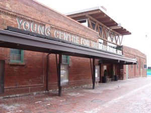
Team 1: Young Centre For The Performing Arts
The Young Centre for the Performing Arts was envisioned by George Brown College and Soulpepper Theatre Company to be home to Toronto’s arts community and a destination for all theatre lovers. Anchored by the presence of Soulpepper’s year-round repertory season and George Brown College’s Theatre School, the Young Centre provides a home for both the leading artists of today, as well as the arts leaders of tomorrow. Find out more here.
Challenge
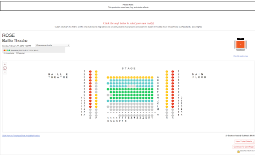
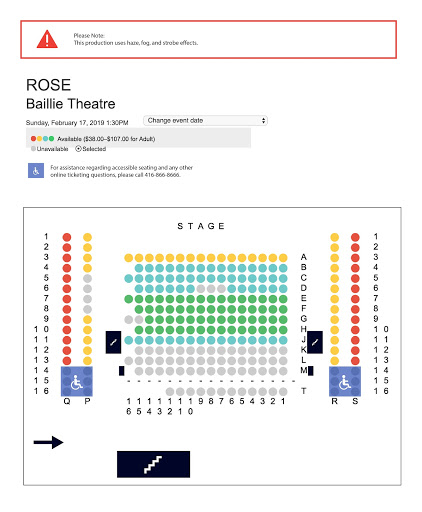
Guests requiring wheelchair accessible seats are not able to purchase seats online and are required to phone ahead to the box office. Occasionally this gets missed by a person on the website, and they follow through the ticket purchase in seats that are not accessible.
Solution
● Mark location of accessible seats using icon
● Clearly show the location of, Entrance points, Stairs, Stage, Balcony
● Make contact information more obvious
● Make a call to action to click the map more readable
● Provide pictures to show what the view looks like from the seats
● Assign designated accessible seats
Prototype
Team YOUNG CENTRE FOR THE PERFORMING ARTS’s
Team 2: Evergreen Brick Works
Evergreen is helping make cities flourish. Cities that are low carbon, inclusive to all and sustainable at their core. Cities to live, move, work, play, learn and thrive in. Since 1991, Evergreen has been facilitating change. Working with other city builders to convene, collaborate and catalyze ideas into action. Their teams connect with many stakeholders to lead with a mindset focused on solutions. They collaborate to develop innovative ideas and catalyze change by testing solutions, developing prototypes and scaling projects. Find out more here.
Challenge
To create a multi-sensory trail experience for those with mobility limitations, and hearing and visual impairments.
Process
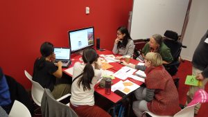
At the beginning the team focused on:
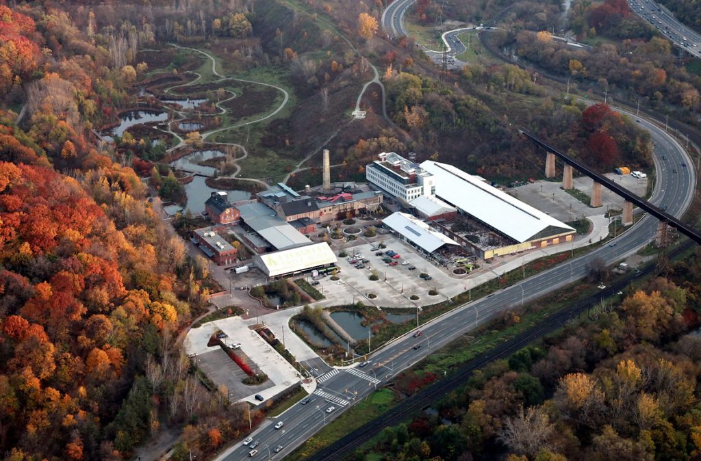
- a visual tour of the trail
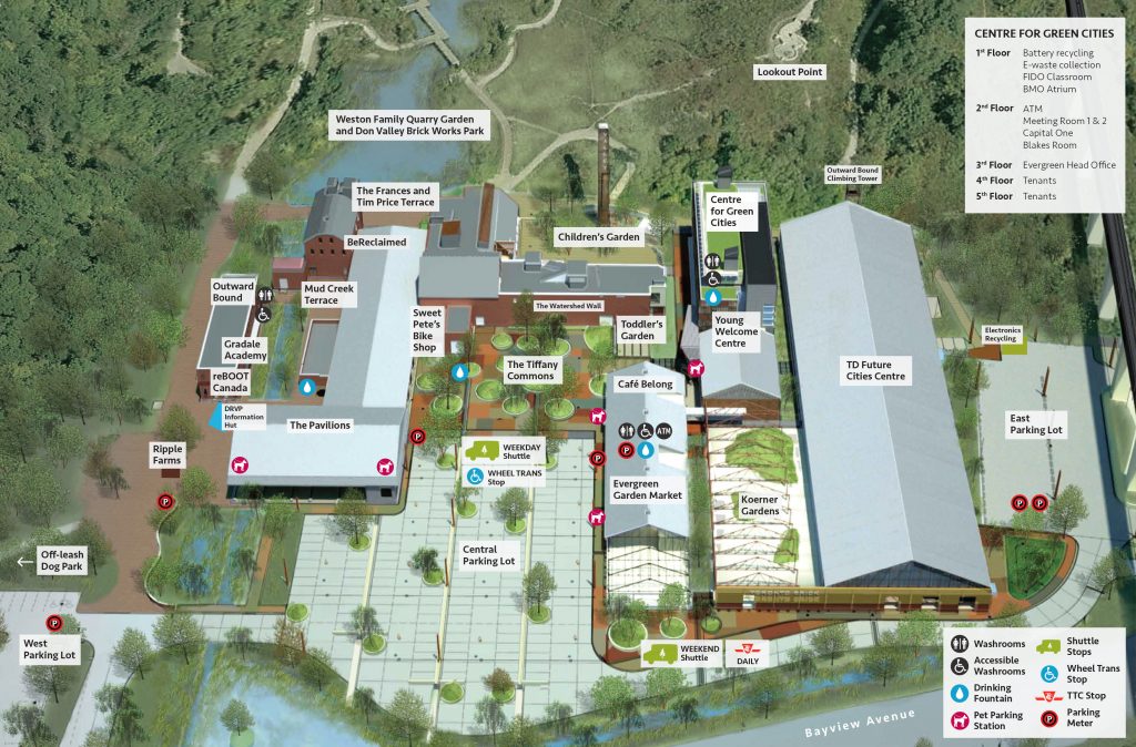
- reviewed site map
- highlighted specific problems thinking about needs and they realized they apply to multiple groups
Then the whole team interviewed people with specific needs
Researched existing solutions
- smart cane: http://mysmartcane.ca/
- blindsquare: http://www.blindsquare.com/about/
Solution
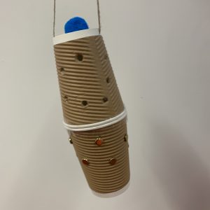
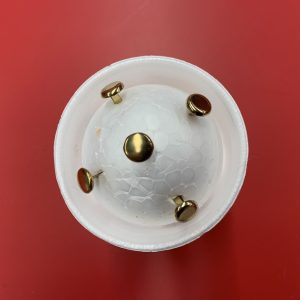
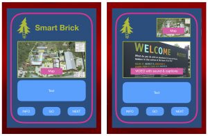
They called the solution “Smart Brick”. What it does:
- Basic Explorer
- Identifies- what surrounds you- birds, foliage, industrial buildings
- Indicates direction
- Signals when you’re walking in a dangerous area (ie you’re about to fall into a pond)
- Identifies what you can touch, sit, hear
- Educated Explorer
- Describes the sounds, sights and significance of each
- You can choose to hear the sounds of the birds that live here, the types of brick that surround you, the source of the smell.
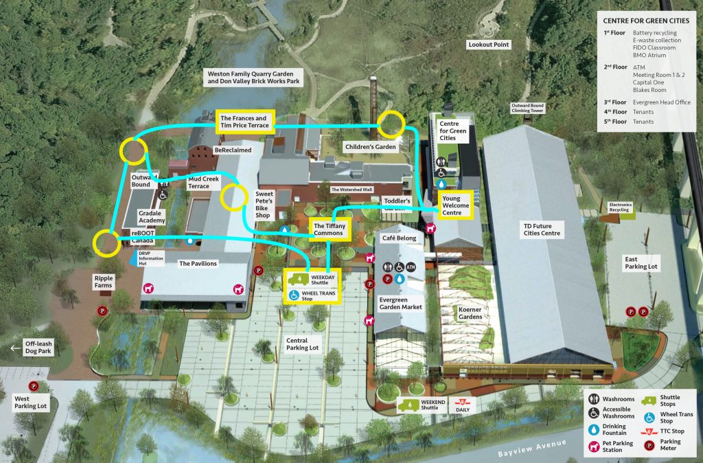
Prototype
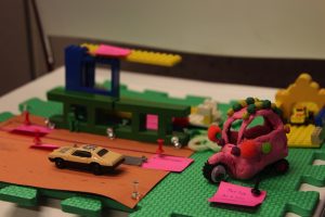
Team 3: In the Soil Arts Festival
In the Soil Arts Festival brings Niagara artists from a range of disciplines together to provide unique audience experiences. The festival nurtures the creation of new work, showcases talent, encourages innovation, offers learning opportunities for youth and provides intimate and uncommon platforms for audiences to experience work by contemporary performing and literary artists, musicians and media artists. In the Soil is Niagara’s homegrown arts festival and is working to make a Niagara that is self-determining and culturally distinct. Find out more here.
Challenge
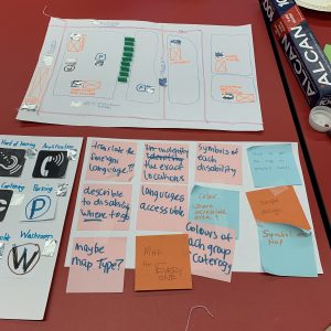
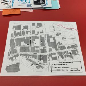
Presenting an accessibility map for outdoor festival hub and every venue of the festival.
Solution
● A simplified map designed inclusively
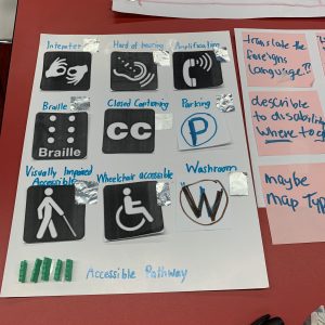
● Includes icons and symbols readable in braille
● Map is simplified at a higher level of abstraction
● This makes navigation easier for all people, Including the visually impaired.
● Incorporating different types of accessibility
● Accessibility feature symbols: Interpretation, Hard of hearing, Amplification, Braille, Closed Captioning, Visually
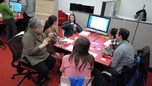
Prototype
Team IN THE SOIL ARTS FESTIVAL Hack’ Prototype
Team 4: Scotiabank Arena
Scotiabank Arena is a multi-purpose arena located on Bay Street in the South Core district of Downtown Toronto, Ontario, Canada. It is the home of the Toronto Maple Leafs of the National Hockey League (NHL), the Toronto Raptors of the National Basketball Association (NBA) and the Toronto Rock of the National Lacrosse League (NLL). Scotiabank Arena has, from its initial design to completion, revolutionized many concepts included in new arenas and stadiums built since then. These features include luxury suites accessible on the ground floor, splitting the main scoreboard into several sections, rotating all sponsor signage in the bowl at once (to allow dominant messaging or “neutralization” for events that disallow commercial advertising), and multiple restaurants in and out of the main arena bowl view. Scotiabank Arena also hosts other events, such as concerts, political conventions and video game competitions. Find out more here.

General Challenge
To create a list of needs of the community of people with disabilities and identify which ones are covered, which are not and suggest some solutions for the ones that are not covered or improve ones that are already in place. You should include: website, facilities, marketing and communications and performances.
Team members
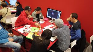
- Hanbin Chang
- Daniel Di Carlo
- Jon Kerr
Design Process
Define the Challenge ⇒ Research ⇒ Brainstorm ⇒ Prototyping
Challenge
Currently, the only accessibility service for people with disabilities at the Scotiabank Arena is for those on wheelchairs. The team founded that other groups of people, who require accessibility services such as hard of hearing or visually impaired people, are not adequately accommodated.
Brainstorm
After gathering pain points and needs of hard of hearing people attending arena. They had a brainstorm session to come up with solutions, using inclusive design principles, that could enhance the experience for those customers.
They came up with two ideas that will enhance the experience in these two areas :
Inclusive Design Solution
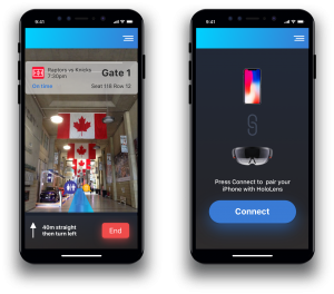
- Their first design solution to help people hard of hearing was using Augmented Reality technology to provide a virtual map of the arena. This solution will not only help people hard of hearing finding seats and navigating to different amenities at the arena, but it will also help other groups as well.
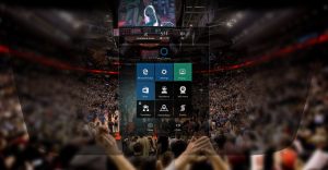
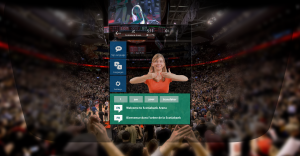
- The second solution was to utilize Microsoft HoloLens with its Mixed Reality technology so that people hard of hearing could experience concert or sporting events with assistive technology while enjoying their experience. Using the Mixed Reality technology, the hard of hearing audience would be able to receive assistance such as live sign language interpreter on the screen or see the live texts appearing on the screen.
Team 5: Idita Design Services
Professional services in industrial design, architectural design, urban design/planning, graphic design, web design, user experience design (UX), user interface design (UI) and user interaction design (IxD). IDITA is sensibly concerned about human factors and their influence in the design process, therefore we consider carefully sustainability, culture, ergonomics, new technologies and their impact on society. It also welcomes international projects and collaborations, providing services in English, French, Spanish and Italian. Find out more here.
Challenge
Studio providing product, architectural and graphic design services to business and startups.Better communication with clients in an interactive and easy way. Make them understand what is design and the design process.
Solution
● Digital Funnel: information collection
● Design Crash Course of design process: instruct clients beforehand
● Design Your own Style: digital game looking for a friendlier and fun approach
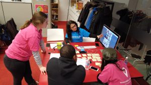
Prototype
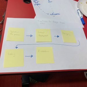
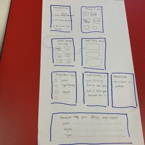
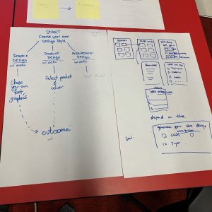
Team IDITA DESIGN SERVICES Hack’ Prototype
Team 6: Worship Practices
To facilitate full participation for people with disabilities, it is essential to address many areas of inclusion. It is not enough to make sure that your new member can get in the door and use the restroom. There is more that can be done to foster a cultural shift in the congregation to develop a better understanding of inclusion and accessibility and the experience of members with disabilities. To learn mover visit Our Doors Are Open project: opendoors.idrc.ocadu.ca
Challenge
A practice integral to various forms of religious service is the burning of incense using charcoal. This has unintentionally caused harm to individuals with invisible disabilities. Both of these can cause a variety of breathing difficulties which can compromise service experiences and overall health. Those affected could feel excluded from services including traditional use of incense.
Solution
● The solution is implemented into the services where traditional incense is currently used, including major holidays and festivals.
● This still allows for a minority of services where traditional incense can still be used. This would be clearly communicated to all community members.
● A commitment to hold scent-free and smoke-free services on all days where traditional services are held, earlier in the day.
● Both forms of service, alteration of pattern of the procession to ensure a scent-free/smoke-free portion of the space.
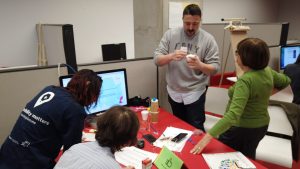
Prototype
Micro Inclusive Design Challenge – DEEP 2018
Our sixth hackathon explored inclusive design from two perspectives. One is to make businesses and services more accessible. The second revolves around the idea of re-designing or re-inventing one of your creations, products or goods.
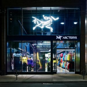
Team 1: Arc’teryx
Arc’teryx was founded by single-minded climbers in need of better equipment, to meet the challenges of our harsh Coast Mountain range. They believe design is a process: prototype, test, revise. Driven by the specific needs of each product.
Challenge
The challenge brought by Arc’terix Toronto was: How can we make a more convenient accessible zipper while still maintaining its function for outdoor use?
Solution
Initially, the team researched a magnetic solution to aid in one-handed zipping, but this would not work on a double-zipper. Finally, they found that velcro was the best solution. High-quality velcro will last longer and will not compromise the durability of the jacket or seal. Offering different coat lengths (zipper lengths) for different body types and disabilities. The potential idea for a plastic silhouette where the double zip can be more easily secured.
Prototype
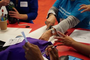
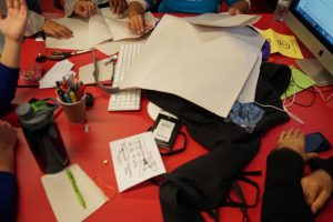
Team ARC’TERYX Hack’s Prototype
Team 2: Bank of Montreal
BMO Financial Group is a Canadian multinational investment bank and financial services company.
Challenge
At the BMO, there is an open space to gather for meetings. There is a system to book, but it is not easy to find yours. How can the BMO make it easier for employees to find the meeting places that they have booked online?
Solution
App for personal cellular that:
● Book the room and
● Guides to get there
Prototype
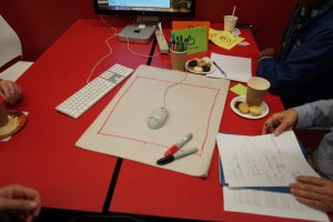
Team BANK OF MONTREAL’s Prototype
Team 3: Metrolinx
Metrolinx is a Crown agency that manages and integrates road and public transport in the Golden Horseshoe region, which includes the cities of Toronto and Hamilton and area, in the province of Ontario in Canada.
Challenge
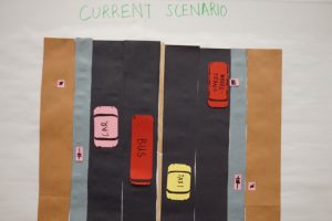
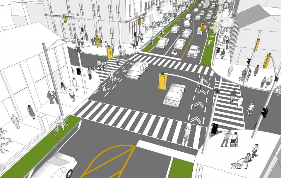
The city wants to install protected bike lanes along main roads, but specialized transit customers need to be picked up and dropped off. In the current design, they either have to cross the bike lane, or the transit vehicle has to block the bike lanes. What can be done?
Process
The group brainstormed:
- User groups: Wheel-Trans users, delivery people, bikers, walkers, bus riders, car drivers, strollers, children.
- Modalities: curbs, paint, tactile pavement, signage, embedded lighting, sonic alerts.
- Incentives/disincentives: Enforcement, incentives.
Solution
● Protected sidewalk cut-outs are best but require wide sidewalks.
● When sidewalks are narrow the road could curve from side to side to leave drop-off zones for bus and Wheel-Trans passengers and commercial deliveries.
Prototype
Team 4: Royal Ontario Museum
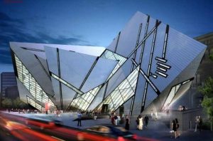
The Royal Ontario Museum is a museum of art, world culture and natural history in Toronto, Ontario, Canada. It is one of the largest museums in North America and the largest in Canada. It attracts more than one million visitors every year, making the ROM the most-visited in Canada.
Challenge
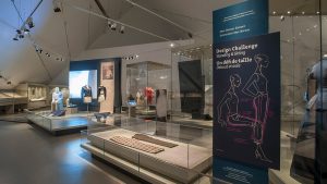
The ROM provides tactile exhibition components with raised letters and braille labels that are “smattered” throughout the museum or a special exhibition – for visitors with full sight one looks around and sees them – or simply comes across them over the course of a visit.
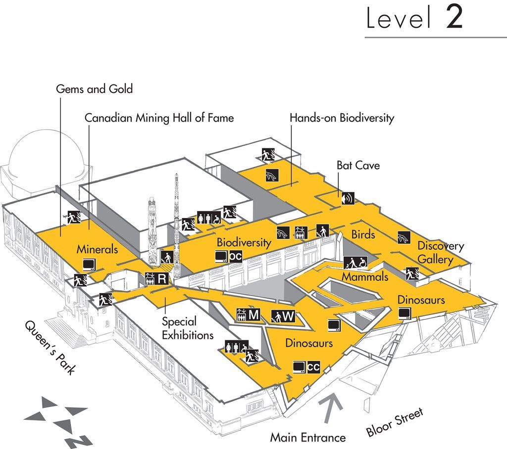
How to improve the museum experience for visitors of all abilities, in particular in regards to way-finding and individual experiences with museum displays.
Solution
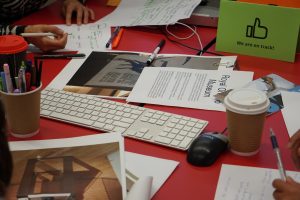
- Using visitor’s own smart devices (location-aware, i.e. beacon, GPS, QR codes or other technologies) or museum supplied device to provide way-finding and deliver content and experience.
- Contemplation space(s) with books, computer stations, braille books/large print books, tactile stations etc.
- Special ticketed entry times to meet the needs of visitors with diverse needs.
Prototype
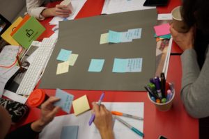
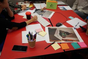
Team ROYAL ONTARIO MUSEUM Hack’ Prototype
Team 5: Theatres
The number of audience members with a disability has increased to 7%, reveals a study of 6,500 productions by Purple Seven in the UK from 2012 to 2015.
Challenge
A local theatre company in Toronto has developed accessible programs and services but does not know how to effectively cannot reach out to the groups that could most benefit from the new inclusive features they are providing for.
Where they are advertising, the company don’t access their target demographic because they don’t know how to connect with the community. What would an accessible campaign look like and how should the company plan to reach their extended target audience?
Process
- Identify accessibility features provided by the theatre
- Identify key organizations in the disability communities
- Design a marketing package to bring communities to the theatre
- Design new features for continuous accessibility improvements
Solution:
- Reaching out disability communities: CWDO, CILT, CPA, CNIB, ASL, LSQ, Toronto Mental Health
Association, March of Dimes. - Arrange an interview with a theatre representative to talk about the fully accessible theatre experience
on CFRB. - Links on the theatre website, facebook, twitter etc. to presentations of accessible theatre experience in
different format: sign language, captioned. - The first time comers get a 50% discount.
- Public education: accessibility ads posters inside/outside the theatre while attracting the general public using an open library, colourful surroundings etc.
- Distribute newsletter each month in a year to promote new coming accessible features.
- Possible new features:
- Wireless access in the theatre to provide the audience with a different format of audio/video to explain
the show based on their needs. - Allow and help people who have accessibility issues to play kind of an own show rather than being audience only
- Wireless access in the theatre to provide the audience with a different format of audio/video to explain
Prototype
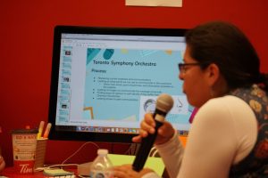
Team 6: Toronto Symphony Orchestra
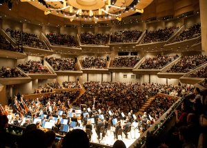
The Toronto Symphony Orchestra is a Canadian orchestra based in Toronto, Ontario. Founded in 1922, the TSO gave regular concerts at Massey Hall until 1982, and since then has performed at Roy Thomson Hall. The TSO also manages the Toronto Symphony Youth Orchestra.
Challenge
TSO has recently received a patron suggestion to explore how the TSO may
better educate patrons on Multiple Chemical Sensitivity.
The challenge is reducing the harmful effects that scented products have on patrons encouraging everyone to “Go Scent/Fragrance-Free.”

Solution
- Creating an educational campaign with:
- Graphics
- Updated awareness: explaining what Multiple Chemical Sensitivity is and how it affects patrons
- Peer to peer marketing: a video presentation
- Opt-in message during purchase path to self-identify Multiple Chemical Sensitivity
- Would link to further information and allow for follow-up directly from the organization
- Creation of buttons
- Creation of scent free section
- When you buy a ticket in area, a pop-up explains that it’s a scent-free
section and what that means
- When you buy a ticket in area, a pop-up explains that it’s a scent-free
Prototype
Inclusive Design Challenge Showcase: Access Density
Partnered with Human Space, a division of Quadrangle, BIG IDeA hosted their fifth hackathon surrounding the future of vertical communities and what is needed to create accessible and adaptable spaces that fit different peoples’ needs.
Team 1: PORTES OUVERTES
Challenge: EXTERIOR SPACE
The size of a vertical community can be a game-changing opportunity for most BIAs (Business
Improvement Areas) and neighbourhoods. What are the ripple effects that a large development can have on its surrounding neighbourhood? How can design amplify the positive contributions?
What does intergenerational living look like, and how do we plan for providing supported and market rate units? What are the factors that go into designing a family-friendly suite, such as stroller storage and play spaces? How do we build community by allowing for a mix of neighbours?
Solution: Moveable Walls
Portes Ouvertes created a floorplan of a vertical living space where spaces were sectioned off to fit the needs of a growing community. They included many modes of adaptable furniture and added movable walls into the space so that areas could be modified. In the more publicly accessed floors they designed the space so that it was adaptable and open, creating a sense of community within the building as well as the surrounding neighbourhood.
Prototype
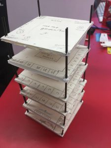
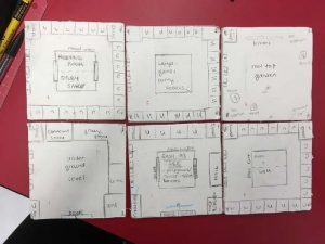
Team PORTES OUVERTES Hack’s Prototype
Team 2: DOWNSVIEW SITE!
Challenge: SITE
What decisions and big moves can be made early on to find a location and develop a site which is inclusive, connected, and resilient? What does a vertical community want in a neighbourhood? What can it bring to a neighbourhood? How can we foster positive engagement with local residents and businesses in the planning stage to create communities which are inclusive, connected and resilient, not just within the development but in the larger fabric of the neighbourhood?
Solution
The team first defined the words “Inclusivity”, “Connected”, and “Resilient” to start framing their work. By researching the needs of a growing vertical community they found out that Downsview would be a good site to develop, focusing on the points of accessible navigation, community interaction, mobility score, and integrated work and market spaces.
Prototype
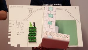
Team DOWNSVIEW SITE’s Prototype
Team 3: TUK TUK
Challenge: TRANSPORTATION
What considerations can be made in the design of a site, the buildings and the public and amenity spaces, to make the most out of transportation options available? How can a new development positively impact transportation for the whole area? What specific challenges are inherent in a “vertical community” itself? How does a new development create accessible, inclusive transportation options which respond to the community’s evolving needs?
Solution: Connectivity
By looking at how space can be managed to introduce interconnectivity Tuktuk created models of how the TTC could be more accessible by developing a multiple path system with smaller communal shuttles. They took care to look at the affordances of such a system, its needs in safety, and its needs in accessibility.
Prototype
Team 4: SKY WAY
Challenge
What exterior spaces can be created because of good planning of a site? What features are
essential, and who has a say in this decision? What opportunity is there to embrace inclusion,
connection to the neighbourhood, and how can the site’s exterior spaces be more flexible and
responsive to community needs? How do design and programming in exterior spaces promote an accessible, connected, and resilient community?
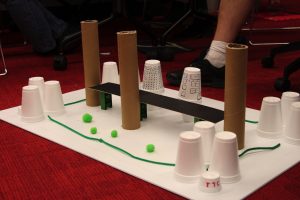
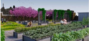
Solution: The Sky Way
Team Sky Way created a bridge platform for a hypothetical vertical community as a recreational space outfitted with gardening areas and seating areas. They researched the needs of green space with urban environments and designed a space where residents can relax and connect.
Prototype
Team 5: CONNEXT
Challenge: EXTERIOR SPACE
What exterior spaces can be created because of good planning of a site? What features are
essential, and who has a say in this decision? What opportunity is there to embrace inclusion,
connection to the neighbourhood, and how can the site’s exterior spaces be more flexible and
responsive to community needs? How do design and programming in exterior spaces promote an accessible, connected, and resilient community?
Solution:: Exterior Connext
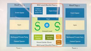
Team Connext designed an outdoor space as well as two rooftop spaces for a hypothetical vertical community and focused on not just greenery but a sustainable and mobile space that would be able to cater to resident needs and wants.
Prototype
With permission of the designer Michelle Villar we post her thoughts on her group’s process: Part 1 | Part 2 | Part 3
Team 6: RETAIL THERAPY
Challenge: RETAIL
New buildings typically have retail space at street level. What makes this space part of the community, and what can it do to be inclusive? What opportunity does the potential retail use have in connecting a neighbourhood with a building? What does resilient and sustainable retail space look like? What types of retail could have a negative effect? What size of retail could be ideal? What choices can be made in the design to foster inclusive, connected retail space?
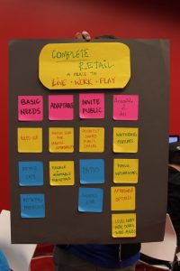
Solution:: Complete Retail
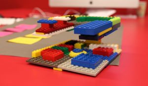
Retail Therapy designed and curated a two floor space for the bottom levels of a condominium so that retail, when integrated to a vertical community, could be beneficial and accessible to the community inside and outside of the building. They listed the priorities that needed to be considered when designing and created a model to show their findings.
Prototype
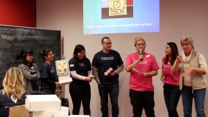
Inclusive Design Challenge: with TELUS
Designing Inclusive Retail Experiences
TELUS commitment to diversity and inclusiveness has been a cornerstone of their award winning culture and they are now partnering with BIG IDeA to build a more accessible retail store experience. A diverse groups of creative minds have gathered to solve a set of design challenges that will improve the way that all customers but particularly persons with mobility disabilities, hard of hearing, and Deaf, navigate and interact with team members at TELUS stores.
Team Radar
Challenge
Researching Accessibility Of A Location. It’s hard for customers with disabilities to know in advance how accessible a store may be if they’ve never been there before but this shouldn’t be kept as a surprise. Customers want easy access to descriptive information about store accessibility as it relates to their individual needs so that they can make an informed decision about traveling to the store; or what they need to know to prepare to go.
Solution
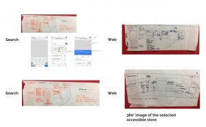
To reduce the number of steps needed to find available accessibility information by making sure the information is visible, locatable, and understandable using icons and descriptions. By providing a 360-degree annotated experience with images Team Radar hopes to avoid surprising customers by being able to highlight store accessibility features ahead of visits. This could be substituted by VR or AR environments in the future.
Prototype
Team Radar’s Prototype
Team L.E.D.
Challenge
Communications Options. Customers looking to research purchase or get support may need to contact TELUS at one of its channels (web, phone, and store). In some cases, a customer contacting one of these channels maybe redirected to a different channel (e.g. from phone to web site). This can be challenging for customers who are deaf or hard of hearing, because of communication barriers with staff and/or low literacy level in English; or for customers with a mobility disability that must now make the extra effort to travel to a store. Throughout their entire interaction with TELUS, customers need to be able to complete tasks they want to do using the channels and communication methods that is most comfortable and natural to them.
Solution
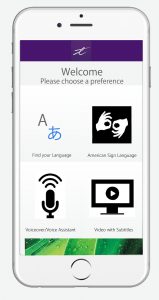
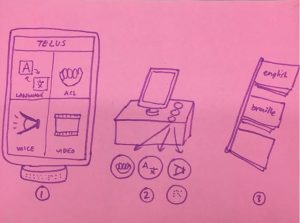
L.E.D. developed multi-channeled system that starts with a website that displays accessibility information that leads into a sign language accessible video. This video would be captioned and also showcased outside of TELUS storefronts on large LCD screens to invite deaf customers. By also providing written blurbs and tablets that present the information in sign language beside products the deaf community is able to easily access phone and plan information. In store customers would be greeted by a TELUS representative who is either from the deaf community, an interpreter, or a person who signs. TELUS could also implement Video Remote Interpreting Service so that deaf customers can communicate directly via a screen to a representative regardless of whether staff in store can sign themselves.
Prototype
Team L.E.D.’s Prototype
Team INTELUS
Challenge
Choosing Phones and Plans. Customers with disabilities are often left on their own to determine what phone and plans fit their specific accessibility needs. Because of the diverse set of products sold through TELUS stores and the frequency of accessibility related questions being less, it is difficult for the store staff to keep on top of all accessibility features of products, plans, and offerings at TELUS. For example, just look at the long list of accessibility setting available on your phone. Customers need to know about special features of devices or service, including accessibility features so that they can make an informed decision about which phone and plans are best suited to their specific needs.
Solution
Virtual system called the T-MATE to match customers with phones and TELUS plans that fit their needs. The T-MATE collects and builds a database of customer needs to suggest certain phones and plans. It also connects users with a community of other TELUS customers and gives them access to TELUS resources based on what they are looking for.
Prototype
Team INTELUS’s Prototype
Team Elephant
Challenge
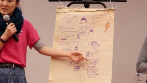
Dignified Access to Interpreter Services. Being able to communicate in your own native language can make a world of a difference. For example, customers whose first language is sign-language (ASL) feel much freer to express themselves when they can communicate through sign-language rather than writing and reading. However, having staff at the store to communicate fluently in the customers native language is not always possible. Customers want a way to guarantee they will have easy access interact in their preferred language as part of an integrated experience.
Solution
Team Elephant created an device to use in store so that customers do not need to disclose their language barrier to TELUS representatives. The devices allow customers to interact freely with ease. Based on their preferred method of communicating with the device, a notification is sent to a customer rep about their preferred method of communication.
Prototype
Team Elephant’s Prototype
Team IMANI
Challenge
Building Confidence of Store Employees. The attitude of the retail staff can make or break the experience for a customer. The staff may have best intentions about helping the customer but they are afraid of saying or doing the wrong thing. As a result, customers with disabilities can sometimes feel that retail staff reacts negatively when they first approach them. Customers want to feel welcome and appreciated when interacting with retail staff.
Solution
Team IMANI plans to develop a mentor mentee system to support TELUS representatives so that representatives are better equipped for assisting people with disabilities. By creating a space that allows for TELUS representatives to relax during situations of high tension and giving them the ability to contact their mentor within a safe space will improve TELUS’s relationship with their customers.
Prototype
Team IMANI’s Prototype
Team USHOP
Challenge
Shopping Independently. Customers who have a mobility disability often have to ask for help just to browse through the stores and look at the merchandise. As individuals, they want to be empowered to browse and shop in the store independently.
Solution
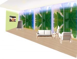
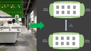
By redesigning the interior space of TELUS stores in the form of adding in additional resting areas, electronic directory services, accessible signage, and top to bottom product organization USHOP has proposed a more accessible space for those of all abilities.
Prototype
Team USHOP’s Prototype
Inclusive Design Challenge: Race-to-the-Edge
Our third hackathon revolved around hacking Artificial Intelligence systems (but not in the way you might be thinking!). We invited our BIG Thinkers to find and develop scenarios where marginalized groups of people might be left out of already created AI systems.
Team 1: Self Driving Car Hack
Challenge
Navigation and Reaction — Create a scenario for a situation that may not be recognized by the vehicle system.
Solution
Self Driving Cars are becoming a not too distant future, so this team used their time to research ways for present systems to be improved using drone traffic mapping. They also sough out how legislation must be updated when self driving cars become available to the market.
Prototype
Team Self Driving Car Hack’s Prototyping process
Team 2: Human Resource Hack
Challenge
HR and hiring and filters for resumes — create a scenario for a resume that may not be considered or automatically rejected by an AI system.
Solution
This team found that since a lot of people are considered “unemployable” because we use outdated standards. We have a high volume of applications for job posting and some qualified candidates get screened out for irrelevant reasons. Jobs are also not created to be inclusive, accessible, or flexible in this day and age. In order to remedy this they created a series of questions and a persona to create a more responsive application system.
Prototype
Team Human Resource Hack’s Prototyping process
Team 3: Education Hack
Challenge
Learning analytics and personalized learning — Create a scenario of a learner or educator who may not be considered or automatically rejected.
Solution
This team focused specifically on public schools in El Arrayan, creating a persona and scenario based on already developing educational structures. These remote schools are funded by the government that uses as AI system to filter which schools need more funding. The issue with this system is that it does not take into account differing features of its surrounding region that greatly impact each school. To solve this, this team created a new set of criteria for evaluation for the AI to consider including things like number of students with disabilities and a locations access to technology.
Prototype
Team Education Hack’s Prototyping process
Team 4: Health Hack
Challenge
Hotline decision support systems. Create a scenario of a hotline call that may be misnavigated or disconnected.
Solution
Eloisa created a persona of a trans man who, after a failed suicide attempt, called a hotline in order to enter the in-patient psychiatric ward. The scenario developed went into how the persona would be misgendered, transferred into the incorrect ward, and then face conflict between their hormonal treatment and their anti-depressant medication in regards to applying to hormonal therapy or sex-reassignment surgery. Eloisa’s solution was to create a new series of questions for the AI to learn from.
Prototype
Team Health Hack’ Prototyping process
Team 5: Banking Hack
Challenge
Loan and credit applications — Create a scenario for a person who may be automatically rejected by an AI banking system criteria.
Solution
The team for this challenge developed a detailed persona of a man who is going through a divorce and is being greatly affected financially. This persona has ADHD and because of his lack of a vehicle due to the separation cannot access his medication regularly. Due to his increasing stress, his work suffers and he starts to miss credit card payments that start to impact his credit rating. This team decided to remedy scenarios like this by creating an added set of questions for banks to assess creditworthiness.
Prototype
Inclusive Design Challenge: with IDRC
Our second Inclusive Design Challenge was a big success! More talented makers came to help solve our new round of accessibility challenges from businesses in Toronto and we ended up garnering a ton of interesting inclusive solutions!
Team 1: Go Nads!
Challenge
To increase productivity and focus for people with mental disabilities.
Solution
NADS (Neural-based Assistive Device Solutions) is a customizable holistic assistive guide informed by EEG and other biometric data to increase productivity, promote healthy living, and empower users to take control of their lives. Go NADS developed a draft of a UI system and website for this project.
Prototype
Team Go Nads!’s Prototype
Team 2: Found in Translation
Challenge
New canadians with low english level have hard time asking store clerks for materials /services they need, they end up spending too long finding for what they are looking for in the stores without knowing if is available or not. How can we improve their experiences in stores?
Solution
To create an easy experience for new Canadians to find and buy the groceries they need, this team created a UI system and physical model to demonstrate a new mobile application that specializes in food and global translation. The physical model was to demonstrate a new way finding system for supermarkets that would correspond to their app.
Prototype
Team Found in Translation’ Prototyping process
Team 3: Runaway
Challenge
Some ramps/hills/inclines are too steep to safely navigate on a hand-powered wheelchair. think of an add on the mechanism for hand-powered wheelchairs that stops runaway chairs or limits their speed.
Solution
A locking mechanism for a wheelchair which will allow the user to move forward but restrict the chair from rolling backwards.
Prototype
Team Runaway’s Prototype
Inclusive Design Challenge: with MakerFest
Our first hackathon was a blast! We loved seeing how quickly teams took to breaking down and solving these real life challenges. A big thank you to all that attended and we hope you had as much fun as we did!

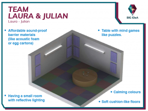
Team 1: Team Laura & Julian
Challenge
For people with autism; how would you create a separate space in a room with minimal materials that could be a “chill out” space if a theatre performance became too overwhelming?
Solution
Having a small room with reflective lighting, calming colours, soft cushion-like floors, affordable sound-proof barrier materials (like acoustic foam or egg cartons), and a table with mind games like puzzles and rubik’s cubes.
Prototype
Team Laura & Julian’s Prototype
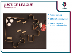
Team 2: Justice League
Challenge
For people with autism; how would you create a separate space in a room with minimal materials that could be a “chill out” space if a theatre performance became too overwhelming?
Solution
Create an environment where a performance can be enjoyed on a smaller, less intense scale.
Prototype
Team Justice League’s Prototype
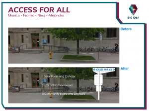
Team 3: Access for all
Challenge
Patrons spend too long waiting for Wheels-Trans buses and miss their buses frequently due to communication and location issues.
Solution
Awareness campaign, solar powered light posts to improve visibility of stop sign, and a mobile app that sends arrival notifications to and from drivers and users to enhance user experience.
Prototype
Team Access for All’s Prototyping process
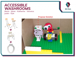
Team 4: Accessible Washrooms
Challenge
What is a sturdy design for a transfer device that could be installed permanently or as needed in public washrooms?
Solution
A transfer device made by redesigning the toilet seat and the support system in accessible washrooms. Thus improving mobility between toilets and wheelchairs.
Prototype
Team Accessible Washrooms’ Prototyping process
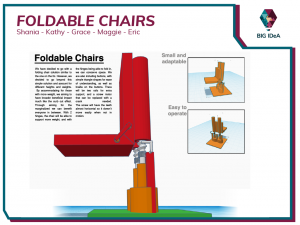
Team 5: Foldable Chairs
Challenge
How do we provide a space to sit in our very small lobby area for those who cannot stand for long periods of time in between performances?
Solution
Create a height adjustable foldable chair to be mounted on a wall. Hence, conserving the walkable space in the small lobby while allowing for patrons to sit and relax.
Prototype
Team Foldable Chairs’ Prototype
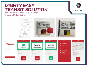
Team 6: Mighty Easy Transit Solution
Challenge
How can an overall transit experience (Payment, stop Request, stop announcements) be made more accessible for those with muscular dystrophy?
Solution
A transponder app (including a low cost hardware) that streamlines payment, trip announcements, and stop requests by incorporating Bluetooth, GPS, and E-Commerce technology.
Prototype
Team Mighty Easy Transit Solution’s Prototype
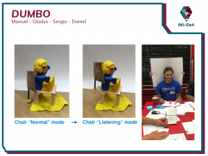
Team 7: Dumbo
Challenge
What are simple solutions to help guests at a table to hear each other and enjoy the music and energy around them?
How can this solution be an unobtrusive part of the decor?
Solution
Redesigning the back of a chair to include a curved adjustable back piece so patrons can control the intake of the sounds and visuals in their surroundings.
Prototype
Team Dumbo’s Prototype


